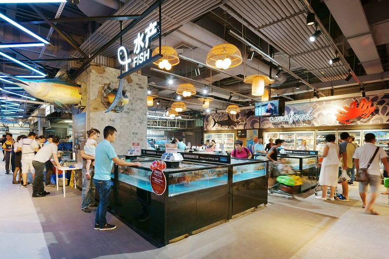
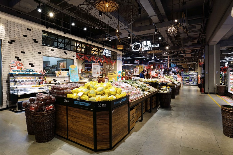
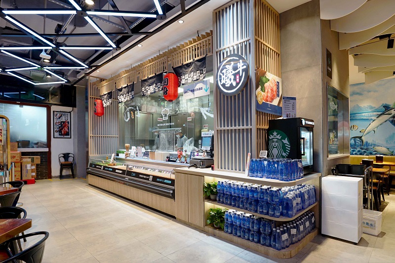
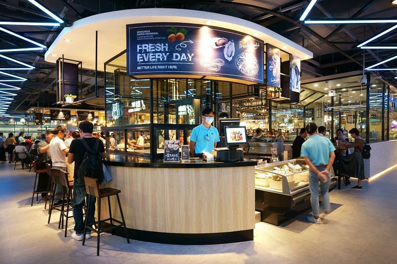
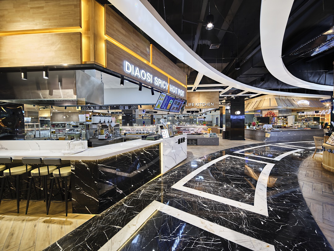
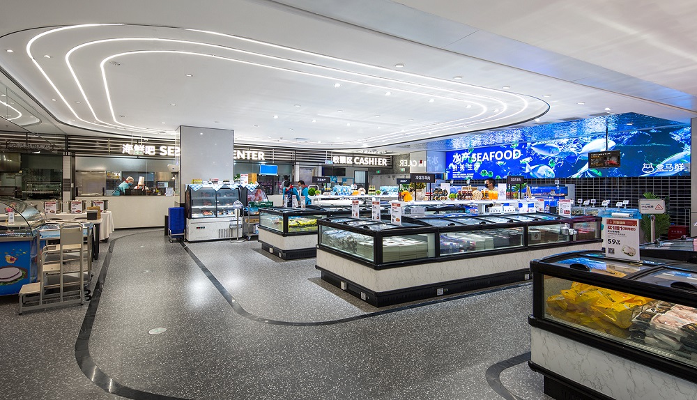
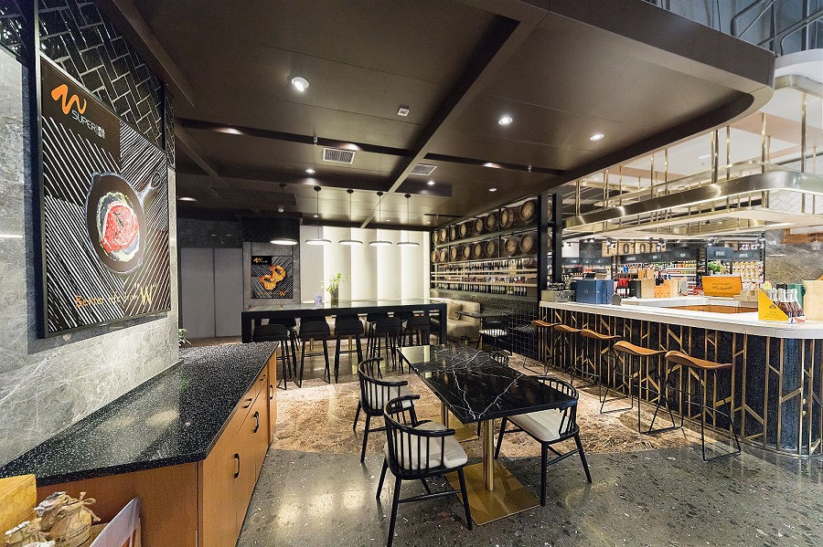
Due to a highly information-intensive society nowadays, vast of consumers can only remember a few of fresh food supermarkets though there have been numerous peer supermarkets springing up. Considering the limitation of consumers’ memories, our client Hema expected to further strengthen its brand image among shoppers and make shoppers deeply cognize the concept of its first supermarket located in the southern part of China through our design. Moreover, our client intended to expand its market share in the region of South China by means of our in-store design and decoration.


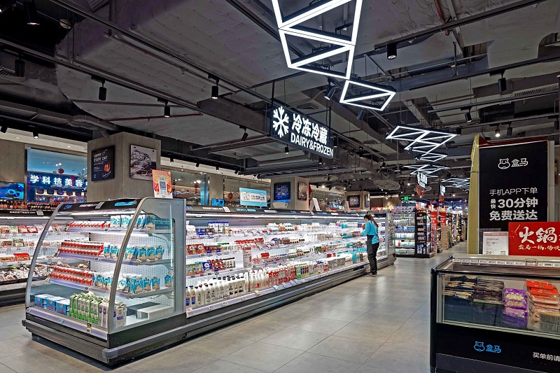
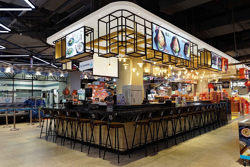
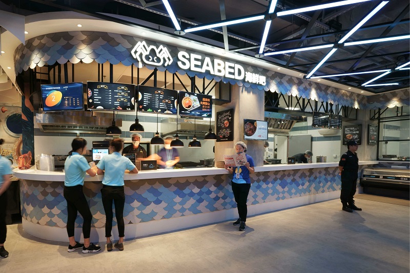
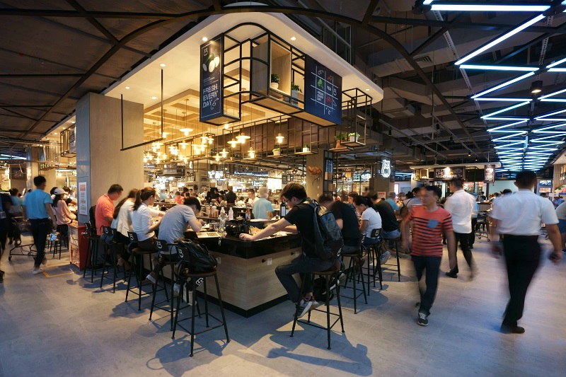
Considering the fact that Hema is not merely a supermarket but a restaurant and vegetable market, we blended warm and modern elements of innovation and decoration into our overall design. By doing this, we created a spatial scenario full of freely artistic, esthetic and comfortable feelings for Hema. Meanwhile, we remained the consistent sense of technology for Hema in the process of our design. Aside from drilling down into the characteristics of business environment, we tried reading shoppers’ minds by investigating the consumers in Shenzhen. Based on our insight into our client Hema and local shoppers, we came out with new ideas for our design—highlighted by innovative sense of space to reach the objects of both deepening shoppers’ cognition about Hema and the in-depth concept of its commercial store. Owing to our design, this sort of “Mysterious Garden” is created and marked by mutual fusion of illuminations and green plants. With the aid of well-placed lighting decoration, the shiny and shaded sides of freshly green plants presented looming visual effects just like an ideal oasis as a whole, which holds the space particularity in the “concrete forest”, enabling everything visible to look natural.
To turn a delightful modern design into reality, we mainly adopted 3 sorts of materials—the cement board used as wall decors, the tiles used as floor décor and the colorful lights for ceiling decors. The colorful lights of the ceiling is a highlight of the whole design. Black mirrored stainless steel and colorful lights of the same height form the overall structure, and connect them with metal components. Based on the combination of our decors and design, we achieved different layout configuration and created a variety of spaces within the scope of the store.


 ONEWE Design is one of the most influential commercial design companies in AsiaMORE
 With years of professional services under its belt, ONEWE Design has become a comprehensive interior design company spanning supermarkets, shopping centers, chain stores, commercial blocks, food markets, office, medical care, catering and cultural tourism space design.MORE
 With a focus on interior design, ONEWE Design provides design and strategy services from business analysis, architectural design, space planning, brand VI design, commercial art exhibition and IP design.MORE
 ONEWE Design pursues an international perspective, prizing maximizing business value with innovation to invirgorate urban renewal and lifestyle change.MORE
